01
Audience
Made for clinic directors
I designed the logo and the visual language for the people the agency sells to: clinic directors and healthcare managers in Europe. I picked colors and type that feel trustworthy and precise.
Elevate Local is a marketing agency for medical clinics in Europe. I designed its visual identity from scratch: logo, colors, type, brand guidelines and a short logo animation. The whole project was done remotely.
Elevate Local helps medical clinics across Europe get more patients through marketing. Its clients are clinic directors, and in healthcare people need to trust you before they hire you. So the brand had to look calm and professional.
The agency had no visual identity yet. I had to design one from zero that clinic directors and patients would trust, and that still looked like a modern marketing team. We worked fully remote, in different time zones.
I started from who the agency talks to: clinic directors in Europe. I explored a few directions, chose one with the client and turned it into a full brand kit.
I designed the logo and the visual language for the people the agency sells to: clinic directors and healthcare managers in Europe. I picked colors and type that feel trustworthy and precise.
I presented each round in a Loom video and explained the reasons behind every choice. The client watched on their own time and sent feedback, so we didn't need to match time zones for calls.
I sketched several concepts with clinic directors and their patients in mind. We picked one together and I refined it over a few rounds of feedback.
I delivered the logo files, the color palette, the type and the usage guidelines. With that, the agency can apply the brand the same way on its website, decks, ads and materials for clinics.




Neutral tones inspired by stone and heavy paper. I chose them because they feel clean and calm, which suits a medical brand.
Geomanist is stable, clear and easy to read. That makes it a good fit for a brand that talks to clinic directors and doctors.
For big headlines, landing page titles and section openers. It's the heaviest weight in the family, so I use it sparingly.
The everyday weight, for subheads, body copy, UI labels and documents. It reads well in long texts on screen.
Want to work together or have a question about this project? Get in touch.
Case study 01 · 2026
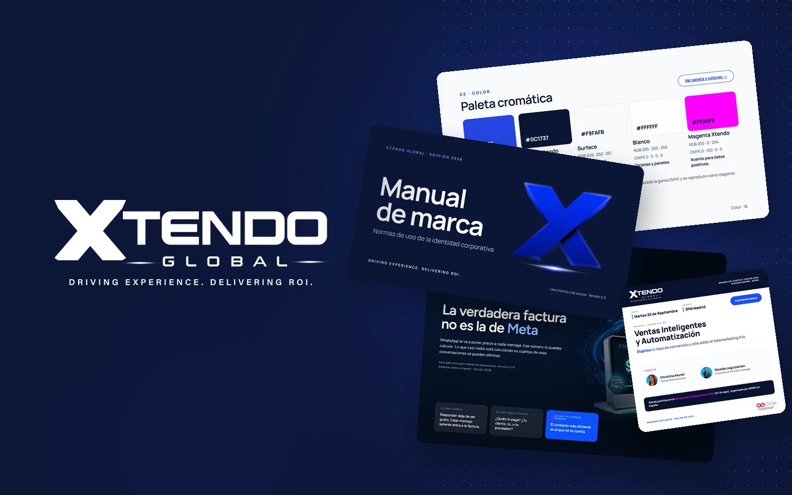
Xtendo Global
Brand manual, sub-brand, HubSpot landings and AI for a company of 1,500+ people